
16 × 20. Acrylic on canvas. Gallery Wrap
This painting is a bold, abstract work characterized by its thick, textured application of paint and a vibrant, contrasting colour palette. The composition is a chaotic yet captivating blend of shapes and colours, with no discernible figures or objects, inviting the viewer to interpret it through emotion and imagination.
The artist has used heavy, impasto brushstrokes, where the paint is applied in thick layers, creating a three-dimensional effect on the canvas. The texture is rough and tactile, with visible ridges and peaks where the paint has been layered or scraped, adding a sense of raw energy to the piece.
The colour palette is striking, featuring a mix of primary and secondary colours that clash and complement each other. Deep blues and teals dominate parts of the canvas, often juxtaposed against fiery reds, oranges, and yellows. These warm tones create a sense of heat or intensity, while the cooler blues and greens provide a contrasting calmness. Black and white are also used prominently, with black adding depth and shadow, and white creating highlights and breaks in the colour blocks. There are also muted grays and beiges that serve as transitional tones, blending the more vibrant colours together in some areas.
The composition lacks a clear focal point, with the colours and shapes overlapping and intersecting in a dynamic, almost frenzied manner. Angular, jagged shapes dominate the canvas, with some areas appearing like shards or fragments, while others are more rounded or smeared. The brushstrokes vary in direction—some are vertical, others diagonal or horizontal—adding to the sense of movement and disorder.
This painting feels like an emotional outpouring, possibly reflecting inner turmoil, conflict, or a burst of creative energy. The thick application of paint and the bold colour choices suggest a sense of urgency and passion in the artist’s process. It could be interpreted as an abstract representation of a landscape, a storm, or even a psychological state, but its ambiguity allows for a wide range of personal interpretations. The overall effect is intense and visceral, drawing the viewer in with its raw, unfiltered expression.
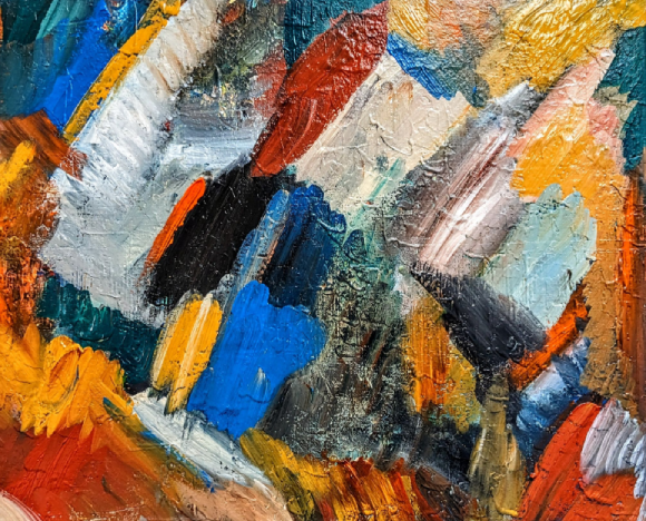